My Blog List

Showing posts with label Oil painting. Show all posts

Saturday, June 10, 2017

Vitality is Vital

"This is my year for getting back my vitality; it was damaged severely over the last four years of two knee reconstructions, a lobectomy and my husband's copy-cat lung surgery.  If I never sit in that lounge chair another minute it will be okay with me.  If I never watch another Monk, Diagnosis Murder or Ellen, it'll be alright with me.  This is my year to get moving!  Unfortunately, with all that time off moping , moving requires rebuilding strength and endurance.  Light weights, biking, elliptical trainer, core, taking over the gardening, walking are all helping. Painting is included too in my workouts, for I do not sit at an easel, I dance at it, as I back up and move side to side before laying down a brushstroke.
The driving force behind my regime is a five week old little girl named Merida Gwyneth Levitt-Roth, my fifth blood grandchild, (I have four bonus loves too).  I want to be around when she can tie her own shoes, wipe her own tush and sound out sentences in Goodnight Moon.  While babies are adorable, preschoolers and up are my cup of delight.
With my foot in Ellis' back, he's getting active too. His drop foot, a permanent affliction, slows him down, but doesn't hold him back.  All in all, we came through this rough patch pretty good.  Hope you  all are fine too?  Plenty of action, social and special interest involvement, curiosity, sense of humor, drive, determination are the essence of the fountain of youth--plus a trip to Florida when the snows pile up ".

Twice a year, my high school publishes a magazine filled with what went on at the school and what's going on with all its graduates;  this is my contribution, for the next publication. It says painting is an activity that's part of another passion: staying vital. 

At 76, I'm very interested in longevity.  I need the time  to improve my painting techniques.  Painting is one  of the activities that extends life and keeps you feeling vital--particularly if you're passionate about it and know that your very best painting will be the next one you do.  We all know it raises you to a level above  all that's going on around you. It lifts your spirits as well as whets your appetite for doing more.That's its gift.  If you happen to sell any, well, that's a bonus, but your spirit is rewarded every time you lift a brush. 

With all my brushes shampooed and reshaped I am back in the studio  where I left off:  Waiting At The Gate.  I'm a bit timid, but I blame that on the Venetian method; It's really up tight and not me, but I have something going that's okay, so I'll follow through.  The nice part, of the first full session was I corrected one gal's expression, got a good idea of what flesh tones and values I'll use and which edges would have to fade. This gal's head will change as I loosen up--but I still want to maintain a flat, traditional paint surface. Glazes are in my future.

Poking at possible flesh tones looking for that palette.  In the process, I corrected her eyes
and found one more correction that has to be done to get the complaining look just right.


Back to my 314 General pencil for another study. 


AND AS ALWAYS (NO MATTER WHAT) DAILY SKETCHES: FREEHAND AND FAST


The possibility of a portrait here.


First flower on the deck: dahlias.  Gorgeous, but may be finicky when it comes to water? 


Merida Gwyneth Levitt-Roth, my third granddaughter. A long name for a very tiny tot.


Hauling Ice,  less than thirty minute sketch from a video reference.


Eva wanted the stuffed pig I brought Merida. I wish I had brought her one too.


Study of James Comey as he testified at the Senate Intelligence Committee Hearing. What
else would you sketch that Thursday morning?


If a member in good standing or not so good standing in the Golden Years, I highly recommend watching If Your Not In The Orbit, Eat Breakfast with Carl Reiner, Mel Brooks, Dick Vandyke and Norman Lear on HBO to get you up on your feet.


Sunday, April 3, 2016

Paintin' Drawin' and Shippin' Out

Morris and Morris and Morris.

Morris is nailed to my easel.  Slowly, progress is being made, but it can hardly be detected by the casual eye.  Details and values are all absorbing. The neck and tuning mechanisms of the guitar is as important  as the features of the guitarist's face. The frets must be believable. The hands must have strings to strum.


Detail:  The neck of the guitar in the foreground is key to making the guitar believable.  It's also key to
creating  a sense of deep space.  It must seem real.  This is a challenge having little experience in this photo realistic
painting form.  If I fudge, it must be only to a minute degree, 


The hands must be believable too.  The hand in the background doesn't exist by itself. It's attached to a wrist bent a
a certain way, and arm curved a certain way, a shoulder that relates to the far side of his face.  Slow and easy
does it.  Lots of looking before the brush is laid down. 
Drawing is constantly being corrected.  Values are constantly being judged and altered.  I am enjoying this slow ride. When I finish a session, I feel like I accomplished something. 


For relief, Daily Drawings. 


RQV, graphite, 6" x 8"


My Lips Are Sealed, graphite, 6" x 8"


Louise's Sister Sara, graphite, 6" x 8"


Willem De Kooning, graphite, 6" x 8"


THE  Chapeau, graphite, 8" x 6"


Hank was varnished and sent home to his parents.  Ruby, JD and everybody else will be following soon.  I think it's better that the paintings be with their families instead of sitting in a dark corner in the storage room.  I am hoping they will put smiles on people's faces.


Hank was the first out the studio door.  The 9" x 11" oil sketch on canvas board was painted in 2012.


Monday, March 21, 2016

Catching Up With Morris


When you begin building a house, the rough structure goes up overnight it seems and then the work slows down as the details are added and slower still when we get down to interior fittings.  So it goes with a painting done in the Venetian style or Photographic Realism.  When I first started Morris, he went together rapidly, but now I'm down to a crawl.  This is a painting about folds--folds in his face, his arms, his hands, his shirt. This is a painting about drapery.  Anybody who has ever painted drapery knows, it is challenging-- and it's even more challenging when it is hugging
structured forms. While Morris looks relatively the same as the last time I showed him, his folds are in the process of  being soften and simplified.  I am also lightening up areas that were muted in the dark to define the forms and increase the volume.  In photographs images are flattened. In painting, they need to be puffed up as if painted from life. Morris's arm is going to need some rounding out similar to the arm of his chair.

I paint all over the canvas.   Using a mahl stick prolongs the session, but only a bit.  When I notice I am about to set the rubber tip on fresh paint, it's time to clean up.  An hour usually does it. But I'm no longer in a hurry to finish this to get on with that. I am enjoying the journey.


Thursday, January 15, 2015

Beethoven on The Beach While I Scumble

Beethoven On The Beach 2, graphite, 6 x 8"  Thirty Minute Daily Drawing Series, January 15th
Beethoven On The Beach 1, graphite, 6 x 8", TMDD series, January 14th
I have no idea if this woman was listening to Beethoven while she relaxed on the lounge across the pool from me, but that's what I would be listening to while gazing at the efflorescent aqua Caribbean instead of photographing her like I was some sort of paparazzi and she a star.  I did like her soft looks and her pristine (by today's standards) cover up. It had an old fashioned look to it.  It looked like something you had to iron. Something I would not have bought.   I just love people watching! --And I suppose people should be keeping their eyes on me. They could end up drawings on this blog.

A WORD ABOUT MY THIRTY MINUTE DAILY DRAWINGS

The drawings are quickly done. I need something quick to balance the very slow painting process I'm using these days. Scumbling is a painstaking technique.   I'm still scumbling  I'll Be In The Hot Tub and yesterday scumbled in an inch of color on the Erin grisaille. I wanted to see if the grisaille made value matching easier.  It does.
 Life is slow in the slow lane of traditional painting techniques. I am enjoying it.  There's no stress other than keeping your brushes clean and your palette orderly.  BUT the method .doesn't support frequent blogging of a variety of completed paintings--so I'm back to drawing-of-the-day, exactly where I started with Blogger five years ago, till April.  That's when I can put my Sun Torch Lamp back in storage--but not the drawing.  The early morning half hours are a delightful way to start the day 

I'VE SCUMBLED I'LL BE IN THE HOT TUB THIS FAR SO FAR:

I've given the woman a drink to keep her patient.


Sunday, November 9, 2014

Old and New Painting Methods Merge


Erin, 9 1/2" x 12 1/2", oil.   So close to color she can smell the paint.
 
 
 Over these last weeks with the Venetian Technique, old and new techniques merged nicely last week. While developing patience, control, an eye for values, skill with flat bristle brushes and tiny, multiple zero numbered sable brushes and the mahl stick, standing at the easel. instead of sitting, holding the long handle brushes at arms length. instead of gripping it up close pencil style and backing up and squinting often, remained part of the dance. Energetic brushwork was not sacrificed.  It showed up between the sunglasses and Erin's left shoulder. Alla prima palette knife free hand work worked well in the background.  Years of drafting, eliminated the distortion that comes automatically with  grid drawing.  The smaller size made the monochrome layer not very demanding.  I would have been into color three or four days ago,  if I hadn't decided to have my carpets, upholstery and windows cleaned for the holidays. 


Monday, May 12, 2014

AN END TO COLOR CHARTS

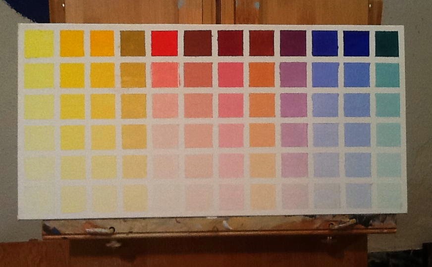
Mums' Day marked the end of my color chart project; I was thrilled. Today marks the beginning of another project suggested by Richard Schmid: a painted sketch a day?  The subject doesn't matter, the color does.

Cobalt Violet, the color Schmid mentioned as a palette staple, but didn't show in his chart collection. I added to mine.


Alizarin was a tricky chart to make. It over powered the other colors easily. It was particularly difficult getting a distinction between the four yellows.

And those two charts completed Schmid's twelve color palette. But I added one more: Ivory Black.I think black has use on the palette. It make transparent colors opaque.


To see the color in the darkest shade, a minute dot of white had to be added. Then I worked gradations up to the base mix.
 From this chart, one might consider taking the darkest shades and bringing them up towards white, but enough is enough. 
 

My wall is complete for now.
A twelve color palette yielded 864 colors with another 72 on the Black Chart. That should satisfy my color needs. 

Max who didn't get the axe got the benefits of the Yellow Ochre Color Family instead. He's coming along much better. My color charts have taken much of the guess work out of determining the appropriate palette for a painting. Over the past weeks I've learned to mix each one with just the right amount of pigment to white and when in doubt, the right color is hanging just feet away.

Max is back in action. His dominant coloring is derived from Yellow Ochre.

I picked up an interesting term from David Hockney over the weekend: SIGHT SIZE.  It means choosing a surface size big enough to draw what I see according to  the distance between me and the subject.  Van Gogh insisted his figurative surfaces were 18 x 24.  I like that size too. It allows the painting arm full motion in laying in the shadows, midtones, highlights and lines.  For heads, I've been finding  this 11" x 9" canvas a tad small. The small size of the space makes me zero in on the face and run off the canvas with the rest of the form. 16 x 12 or 16 x 20 might be more suitable for more comprehensive close-ups? Schmid used 22 x 18.  Van Gogh sized his paintings by how many he could get out of a roll of canvas.  Hockney constructs his huge compositions in units. Along with painting little squares, I've been doing a lot of reading  and video watching.


Friday, April 25, 2014

Max Got The Axe And...


So did Sweet Shop and Strawberry Torte. So it goes. 


Disappointed? Yes. Will I recover? Already done. Just paying my dues. (I took out Max.  I couldn't look at that pathetic attempt one more day. Why should you?)  If DJ Hellerman, photographer of the homeless and video maker of paper coming out of a copier ,from Vermont, declined these, he obviously is on a diet and  has lost his sense of humor. And how can there be just one jurist for a state art competition and only 100 artworks accepted?  I knew the area was depressed, but never figured we had a shortage of skillful artists.


Wednesday, April 23, 2014

Thanks Sharon! Sorry Sharon.

A Day Off With Sharon Wright

Sharon Wright and I Skype.  When we spoke  last night, she was kind enough to mug for the camera and I took three shots of her.  I spent today attempting Sharon alla prima.  She was a great break from color charts and provoked an epiphany. I will live well past a hundred.  I need the time to get this painting thing right.

Alla prima is both a wet into wet painting technique and a  style of painting. It is the most difficult of the styles calling for a keen, articulate brushwork, brush work I haven't mastered. This was painted wet into wet using just four colors, three of which I have charted--Ultramarine, Terra Rosa and Viridian. Cobalt mixed with Alzarine, three steps down on the Cobalt chart was used for her shirt.

While I have a good sense of mixing from charting, I need as much practice as I can get  developing the lively brushwork that characterizes the Alla Prima style.  Today's effort, thanks to Sharon's mugging that excited me enough to put  the charts  aside, was a delight, if not a disaster. Sharon's face and nose are too long--not in life, not in the photograph, but on this canvas. I did get her fabulous cheekbones though. Sharon hasn't seen the last of me.

"Bue larger compositions must mature gradually, and for a drawing with, let's say, 3 seamstresses, one might have to draw 90 seamstresses. Voilaacute; l'affaire."
  
Vincent Van Gogh from The Letters of Vincent Van Gogh, Penquin Books Ltd.


Thursday, March 27, 2014

Sexy Cobalt Blue

Figuring out just how much white to add to equalize the steps towards a tinted white is one of the biggest concerns when charting.  I had to go back into two mixes to make corrections and may go back into a couple more--cobalt blue with cobalt violet and cobalt blue with TRO. 

Sexy Cobalt Blue was chosen for chart three. As you can see the colors are deliciously rich.

Terra Rosa is chosen for chart four, next to come. There is a burning red in there, whereas Transparent Red Oxide leans towards orange.

Yellow Ochre was chart two. 

And chart one was the Tube colors Richard Schmid chose for his palette, which differed from mine by Viridian instead of Thalo Blue Green, Cobalt Violet instead of Dioxinine Purple, Cadmium Lemon yellow as the lightest yellow instead of ordinary, Cadmium yellow light with no green in it, and no Naples Yellow at all. Some color close to Naples showed up on the Yellow Ochre chart.  On this chart,  Cobalt Blue and Viridian offers a color close  to Cerulean Blue, but no cigar. Whether Cerulean remains on my shopping list is a question still to be answered when all the facts are in. That goes for Naples Yellow as well.

The three colors I chose to chart first make up the simplest palette that offers a range of colors that apply to a couple of paintings I have in progress.   When I finish the Terra Rosa chart, I'll know all I need to know to finish two of those paintings.  JD and My Guys however call for a Cadmium Red Medium Chart. So guess what I'll be doing after Terra Rosa. I am thoroughly enjoying the academic approach to color.  It allows me to plan and keeps me from getting carried away by intuition and a love for spontaneity, which are imperative to have, but only best when backed with solid information. 

NOTE:
After a couple of weeks doing this, I've learned:
Not only did I choose the wrong white for this project, but also the wrong oil medium.  Linseed is the slowest dryer. The Yellow Ochre chart is still wet to the touch. Gamblin Galkyd and Galkyd Lite dry within 24 to 30 hours.  The difference between them has to do with the texture of the finish. Galkyd flattens brushstrokes and will give an enamel like finish and is the fastest drying of the two.  This oil would have been appropriate for this project along with Gamlin Quick Dry Titanium White. When I bought my oils for my first portrait  two years ago, I had no idea when I chose to do it in oils there were so many things to consider.  Linseed oil, turpentine and tubes of paint had been my only supplies when I gave up this medium fifty years ago. Things have come a long way. Thanks to our demands and the grinders of paint. 


Monday, March 24, 2014

Yellow Ochre is Anything But Boring

                                   
  Curiosity is my middle name. It's a vital force. It keeps me searching, reaching, growing. This last week I chose to poke around with yellow ochre, the color an artist friend described as boring, lackluster and old fashioned.  Well, I'm an old fashioned gal. Yellow ochre has been on my palette from the get go when all I had for a "studio" was the make up desk in my bedroom full of chintz, carpeting and flowered taffeta bedspreads that thankfully didn't show the paint spots that sprayed everywhere as I danced and taught myself how to paint.
 
Yellow Ochre was my choice for chart two of the twelve chart project I've undertaken to better understand my oil colors. I want to know what's on my palette intimately and this one seemed like a good one to investigate first.

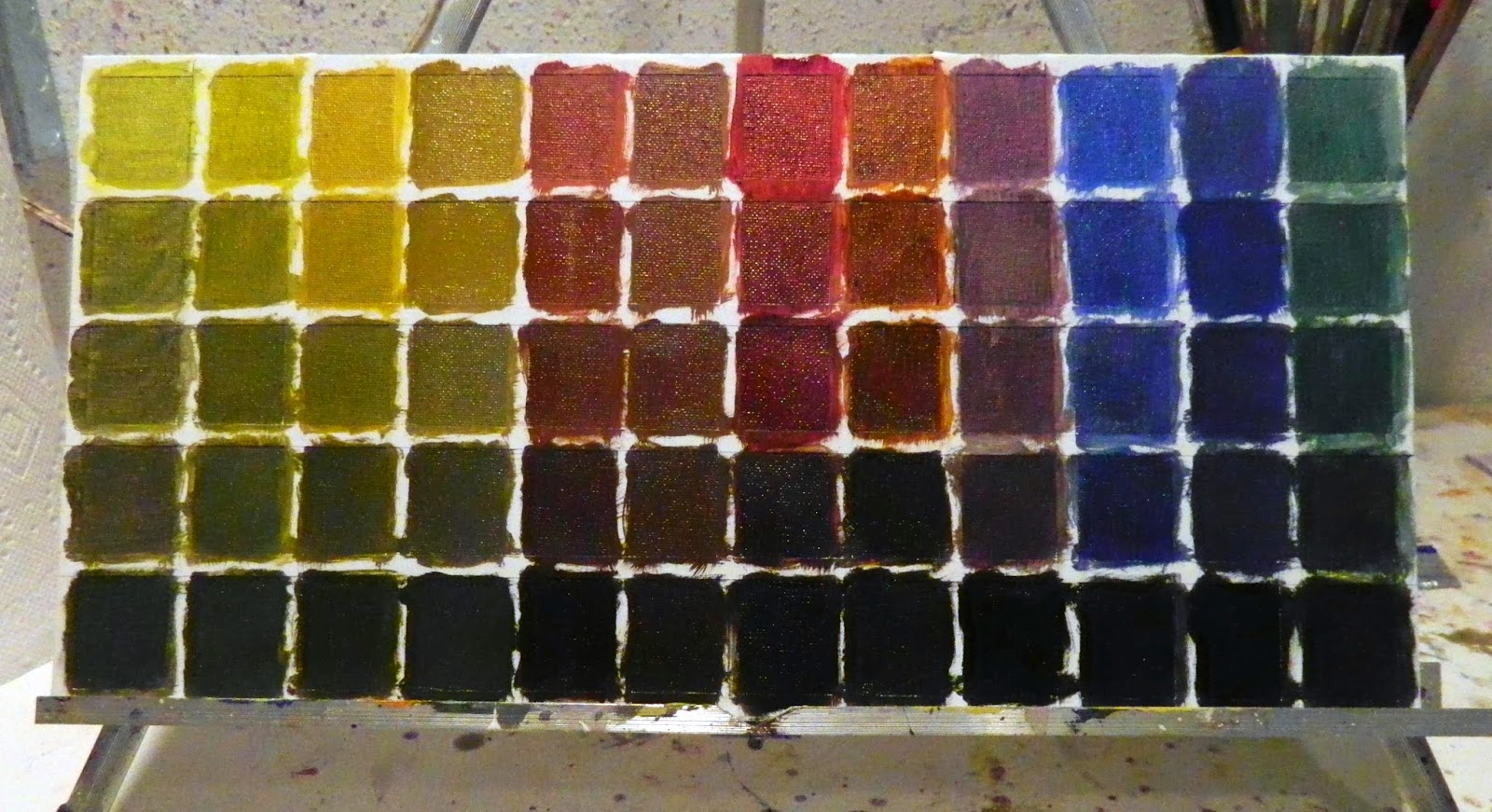
Yellow ochre out of the tube occupies the first square in the top row, left hand corner. All the other palette colors across in that row have been mixed with YO as the dominant. The lower rows are  five step gradations towards  white.  Some of the squares may look alike, but a close up look reveals a slight shift towards warm or cool--that might make all the difference between a color value sitting pretty or looking like mud. (Mud is any color value not in sinc, in harmony, with the others around it. It's not that gray you get when you mix all the colors together to find a common denominator to pull the painting together--the gray way to harmonize color). 

As I sat and patiently mixed yellow ochre with each of the other colors on the palette, I was totally involved getting the five gradations towards white  even with one another. To do that, corrections  had to be made along the way. Different colors having different powers of saturation. There was no set formula to make charting easy, but starting with a smear of white and working from the whitest tint to the darkest color mix worked best.  In the process, one quickly learns cleanliness is next to Godliness. On the paint table, I kept mineral spirits and a half and half mix of Murphy's oil soap for thoroughly cleaning the brush between color changes.  The  palette needed constant cleaning too. No contamination is key to a reliable chart.


Also key is knowing where the five color values fall when compared to a five step gray scale. So I charted that too. It's a handy tool for determining the values of your subject and where to find the value match on the charts. It gives you a place to start and eliminates excessive mixing for having charted the color, you already know the proportions of what to what.  For this gray scale I used the faster drying Titanium White and Ivory Black.  The black you see though isn't the black of the tube.  A little white was added to bring it closer to a number 9 or 10 gray on a photographer's gray scale. You can't see it accurately in this reproduction, but Titanium definitely has a bluish tint--making charting Flake White with Ivory Black interesting IF I wasn't so anxious to get on with Cobalt Blue versus Ultramarine Blue. The two look very close to me who does love Cerulean Blue over Ultramarine and may want to make my own adjustment to Schmid's palette?
 
Over the weekend, chart number one finally dried enough to remove the tape.  Letting the white in  illuminated the colored squares that appeared darker, retracted, when  surrounded by black. Once again proving that joinery is everything.


While charting took up a lot of time this last week and weekend, it did not get in the way of my working on Rain and My Guys.  As a color came up that applied to these paintings in progress, I used it--and I knew how to mix it again when the batch was gone.   Love being curious, determined and wiser. Love not stumbling around looking for the right value while wasting paint. 

Thursday, March 20, 2014

What Do You Do When You're Out of Flake White?

You put your Yellow Ochre color chart aside and work on another unfinished painting where yellow ochre is definitely a color on the palette--that and Cobalt Blue and TRO--plus tons of Titanium White, which was in stock.  The more I work on these charts, the more charts I can think to add to my collection like what's this basic palette look like mixed with black?


Self Portrait with Straw Fedora, 12 x 16, oil.  My brush strokes are getting looser. Yay!

 
Under The Blue Umbrella, pencil sketch.
All color charts and no sketching is too much work and not enough play.
 

Monday, March 3, 2014

Am I Getting Anywhere?


Or am I spinning my wheels?  The flash discoloration in the reference is both exciting and maddening. Part of me likes what's going on with the color- intense violets and blues and yellow greens showing up in odd spots next to blotches of reds.  Another part of me wonders what the hell I'm doing? Jon's not golden enough and everybody is blotchy.  It doesn't help that I'm reading Van Gogh and Sargent simultaneously. Sargent used layers of  glazes in combination with gestural brushwork.  Van Gogh blend colors with short linear strokes with a small brush. It doesn't help that my palette is too small for mixing large batches of paint appropriate for a 36 x 20" canvas.   In spite of all the trial and error, my likenesses are good-- the somewhat  unconventional colors are interesting--and I have managed to make the position of the guys believable. 

Add to this floundering abou,t my floundering about with Windows 8.1, the weekend was not a fun one. Relief came on Saturday with an Amazon delivery of Windows 8.1 for Dummies along with a very helpful DVD tutorial.  While I have figured a lot of this new system out, the DVD was very helpful teaching me to manage my photographs, my biggest use of my computer. What the book didn't tell you though was how to play the DVD. With 8.1, you just don't put it in the drive and  it plays.  There's a procedure you have to figure out after you figure out there must be a procedure. :-)

Tuesday, November 5, 2013

What A Day!

I had my last physical therapy session. I walked painlessly down to the lake and back. I accomplished what I wanted by having this surgery.  I  photographed. I painted and, yes, I danced with delight.

My knee still hurts, but the hurt is different. It's the hurt that goes along with being cut in surgery then having to put in the time to heal. The pain of walking that was there before surgery was missing. As I made my way down to the lake, I was ecstatic.  When I reached the dock, I felt like Rocky after running up the 72 stone steps in front of Philadelphia's Museum of Art.

I took my camera on my thirty minute "building stamina" walk, of course. I had to record the event. I had to shoot whatever struck me as worthy of painting. These photographs have potential:

This would be a wonderful, mural sized painting. It would also make a fantastic frosted glass design.
I like the pale beige/grays and the peaceful horizontal composition. 

I'm liking the grays in this photo and the subtle colors in the far background. they only need a tad of punching up.
Note the ducks. There were hundreds of ducks that my presence sent paddling for the opposite shore.

The water needs textural development, but this too would make a grand mural.  The dots are the ducks.
Looking at the photo in this medium, I might change the proportions of the horizontals?  But, again, I'm liking the grays.

THEN I TOOK PHOTOS OF POSSIBLE PAINTING EXERCISES AND TRIED ONE OUT THIS AFTERNOON.  REPITION  ALWAYS GETS ME. IT'S WOVEN INTO OUR LIVES.


Turn Left at The Sign.

Turn Left at The Sign, alla prima oil on stretched canvas, 8" x 10"
A good start back. I painted seated, but started popping up more and more as I got into it.  Old dog.


ART HISTORY NOTE:  VG's "The Irises" sold at Sotheby's for 53.9 million 1987 dollars. In today's dollars, who knows how much that painting would go for? What's the highest price someone paid for one of your paintings?  I got eight hundred once for one of mine. 


I did the puzzle this morning.  I love this new iPad app. I love this painting and have had my nose two inches from its surface at least fifteen times. What joy I felt every time.
       
The one painting VG sold in his lifetime was Red Vineyards Near Arles for 400 francs in 1888--in today's dollars, about eighty dollars.  You think he charged too much?  No.  Too little.

Red Vineyards Near Arles, Vincent Van Gogh, 1888

Thursday, August 23, 2012

Could A Gal Ask for a Better Day?


Zac is getting more Zac-like. Still some tedious detail work to be
done, but I'm starting to see his mother's eyes.  His mandibular needs
narrowing down on the left. Alas, tomorrow is another short day.
Friends coming in from Florida. Slow and steady Linda.
But when you're hot, you're hot. Drat life's interruptions.


The stuff that makes my heart sing. Did you  know
that the Faber-Castel family started manufacturing
pastels in 1761. These 72, soft, half sticks should
produce some decent marks.
Get me into an art supply store and frugal flies out the window. My feet leave the ground as I float up and down the aisles looking at the stuff I love. I went in to buy Burnt Umbra and Cadmium Red Medium, a short list. I came out with the paint plus three more slanted flat brushes (my new favorite) and a set of Faber-Castell 72, half stick, soft pastels. I am a art supply junky.

 I'm also a junky for comfort clothes that make you looked dressed up, but underneath, you're not. On my way home, I stopped at my favorite boutique to see what was going on for Fall. I hit pay dirt. Not that we go anywhere, but thinking we could, I picked up a few must haves. When I put my packages on the breakfast room table, Ellis was not as thrilled as me. He wanted the wife back he used to have, the frugal chick who never left the house. That chick is gone. He's quoting. Residential construction jobs are increasing. Cash flow is picking up. I, being the respectable female that I am, did my thing: churned the economy for the betterment of mankind. I did my duty for God and country.

 I gave him a kiss and the bills, put on one of the tops I bought, my Niki shorts and headed for the studio with my new pastels. I was all dressed up for my swim later. Could any gal ask for a better day?

Thirty minute warm up with Sargent. I think I gave the guy a glass eye?
If only I had ten minutes more. He does look shifty.


Wednesday, August 22, 2012

The Kid's Teeth Are Just Fine


Things seem to be working  okay with this one. I'll know for sure
when  get to that mouth.


Work still in progress.
At great expense to his father, Zac's teeth are picture perfect. Just not in this painting in progress. It was time to quit, Zac's tricky mouth is definitely something to be painted in the morning while still fresh. Unfortunately, tomorrow morning I'm out of here early. I've got appointments, then the art supply store for the paint I thought I had, but didn't and the dollar store for Totally Awesome. I didn't button my smock and low and behold my white tee with beige palm trees ran into a loaded brush of Transparent Red Oxide. Zac mouth will wait.

 For my thirty minute warm up this morning, I copied a charcoal drawing of Sargent's. Didn't do a bad job, didn't do a great job. Actually, it was the first copy I've ever made of a master's work. Learned a few things and reminded myself that there is painting/drawing in the museum galleries every Monday if I cared to put that kind of equipment together and drive downtown. It's a thought. Had I not taken the time to warm up, maybe Zac's mouth would have been operative?


Copying Sargent for warm up. Unfortunately none of the master's
talent rubbed off. But I did learn he used white pastel with his
charcoal. I didn't read it. I just knew it. For the range of grays
to be that full he had to go very dark then lighten up brighter than
a knead eraser would allow.

 It was a good day. Both my guys are looking like themselves; I'd recognize them anywhere. It's important to remember that a likeness in portraiture is not an exact duplication of the subject.

 According to Miriam Webster's Dictionary it is:
like·ness/ˈlīknis/ Noun: The fact or quality of being alike; resemblance: "her likeness to him was astonishing". The semblance, guise, or outward appearance of: "humans are described as being made in God's likeness". Synonyms: resemblance - similarity - semblance - similitude - image
That lets portrait painters off the  hook in my opinion. I wonder if it would satisfy the client?