Curiosity is my middle name. It's a vital force. It keeps me searching, reaching, growing. This last week I chose to poke around with yellow ochre, the color an artist friend described as boring, lackluster and old fashioned. Well, I'm an old fashioned gal. Yellow ochre has been on my palette from the get go when all I had for a "studio" was the make up desk in my bedroom full of chintz, carpeting and flowered taffeta bedspreads that thankfully didn't show the paint spots that sprayed everywhere as I danced and taught myself how to paint.
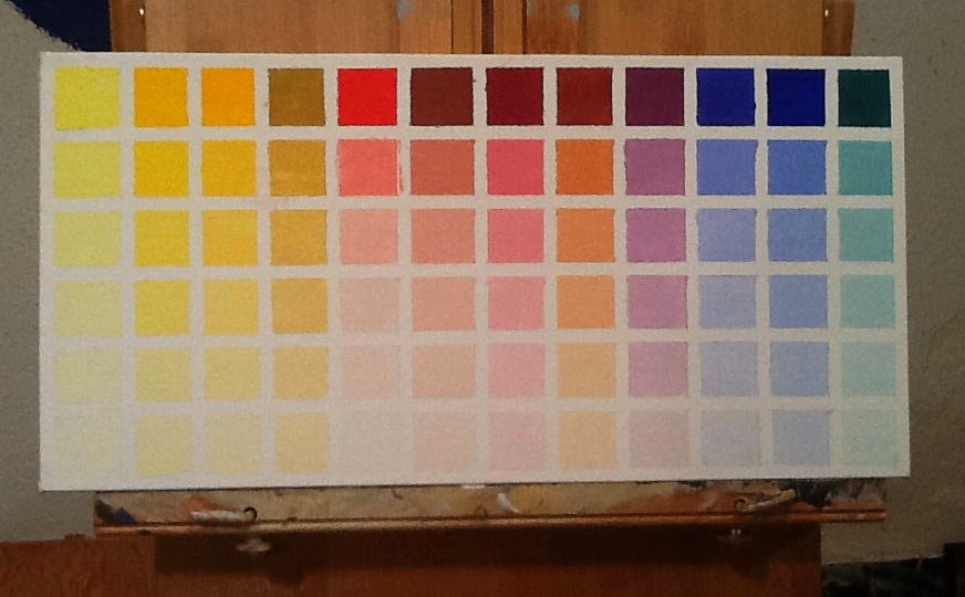
Yellow Ochre was my choice for chart two of the twelve chart project I've undertaken to better understand my oil colors. I want to know what's on my palette intimately and this one seemed like a good one to investigate first.
Yellow ochre out of the tube occupies the first square in the top row, left hand corner. All the other palette colors across in that row have been mixed with YO as the dominant. The lower rows are five step gradations towards white. Some of the squares may look alike, but a close up look reveals a slight shift towards warm or cool--that might make all the difference between a color value sitting pretty or looking like mud. (Mud is any color value not in sinc, in harmony, with the others around it. It's not that gray you get when you mix all the colors together to find a common denominator to pull the painting together--the gray way to harmonize color).
As I sat and patiently mixed yellow ochre with each of the other colors on the palette, I was totally involved getting the five gradations towards white even with one another. To do that, corrections had to be made along the way. Different colors having different powers of saturation. There was no set formula to make charting easy, but starting with a smear of white and working from the whitest tint to the darkest color mix worked best. In the process, one quickly learns cleanliness is next to Godliness. On the paint table, I kept mineral spirits and a half and half mix of Murphy's oil soap for thoroughly cleaning the brush between color changes. The palette needed constant cleaning too. No contamination is key to a reliable chart.

Also key is knowing where the five color values fall when compared to a five step gray scale. So I charted that too. It's a handy tool for determining the values of your subject and where to find the value match on the charts. It gives you a place to start and eliminates excessive mixing for having charted the color, you already know the proportions of what to what. For this gray scale I used the faster drying Titanium White and Ivory Black. The black you see though isn't the black of the tube. A little white was added to bring it closer to a number 9 or 10 gray on a photographer's gray scale. You can't see it accurately in this reproduction, but Titanium definitely has a bluish tint--making charting Flake White with Ivory Black interesting IF I wasn't so anxious to get on with Cobalt Blue versus Ultramarine Blue. The two look very close to me who does love Cerulean Blue over Ultramarine and may want to make my own adjustment to Schmid's palette?
Over the weekend, chart number one finally dried enough to remove the tape. Letting the white in illuminated the colored squares that appeared darker, retracted, when surrounded by black. Once again proving that joinery is everything.
While charting took up a lot of time this last week and weekend, it did not get in the way of my working on Rain and My Guys. As a color came up that applied to these paintings in progress, I used it--and I knew how to mix it again when the batch was gone. Love being curious, determined and wiser. Love not stumbling around looking for the right value while wasting paint.


.JPG)