
.JPG) |
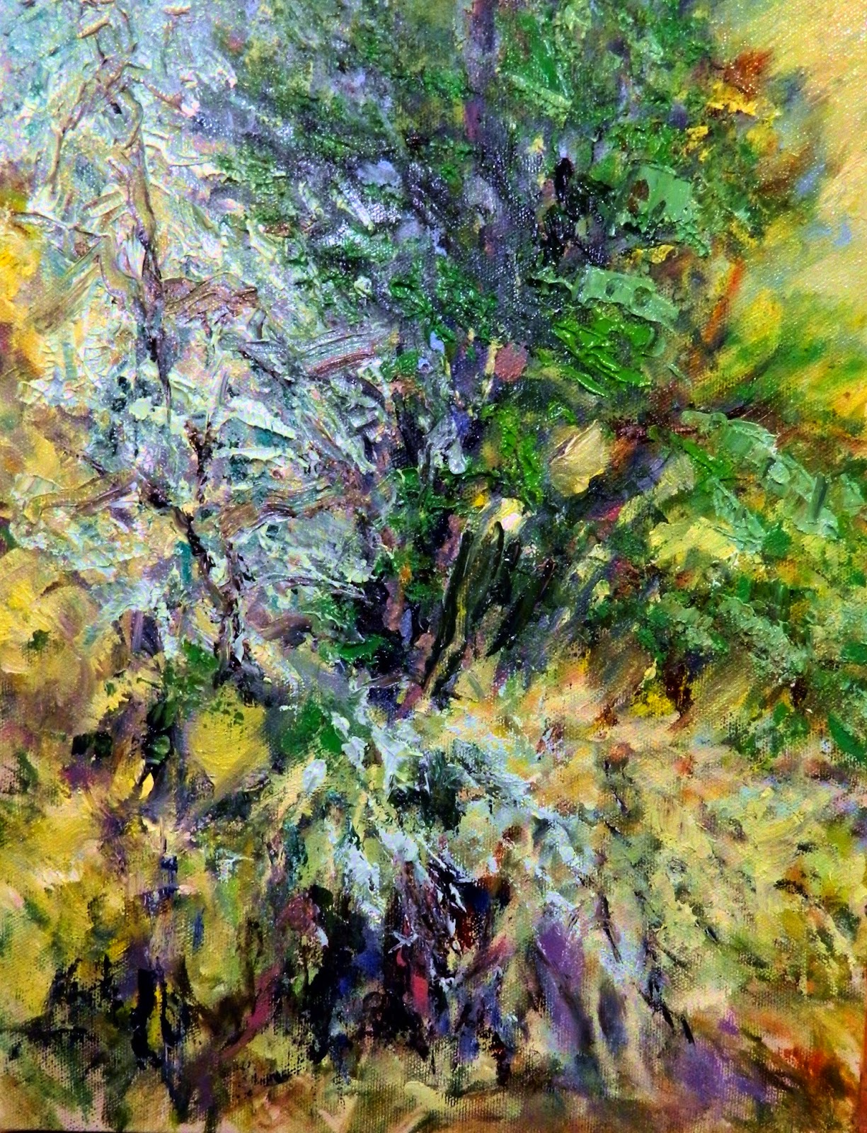
| Inspiration Plein Air, studio completion from memory. |
It was a green week.
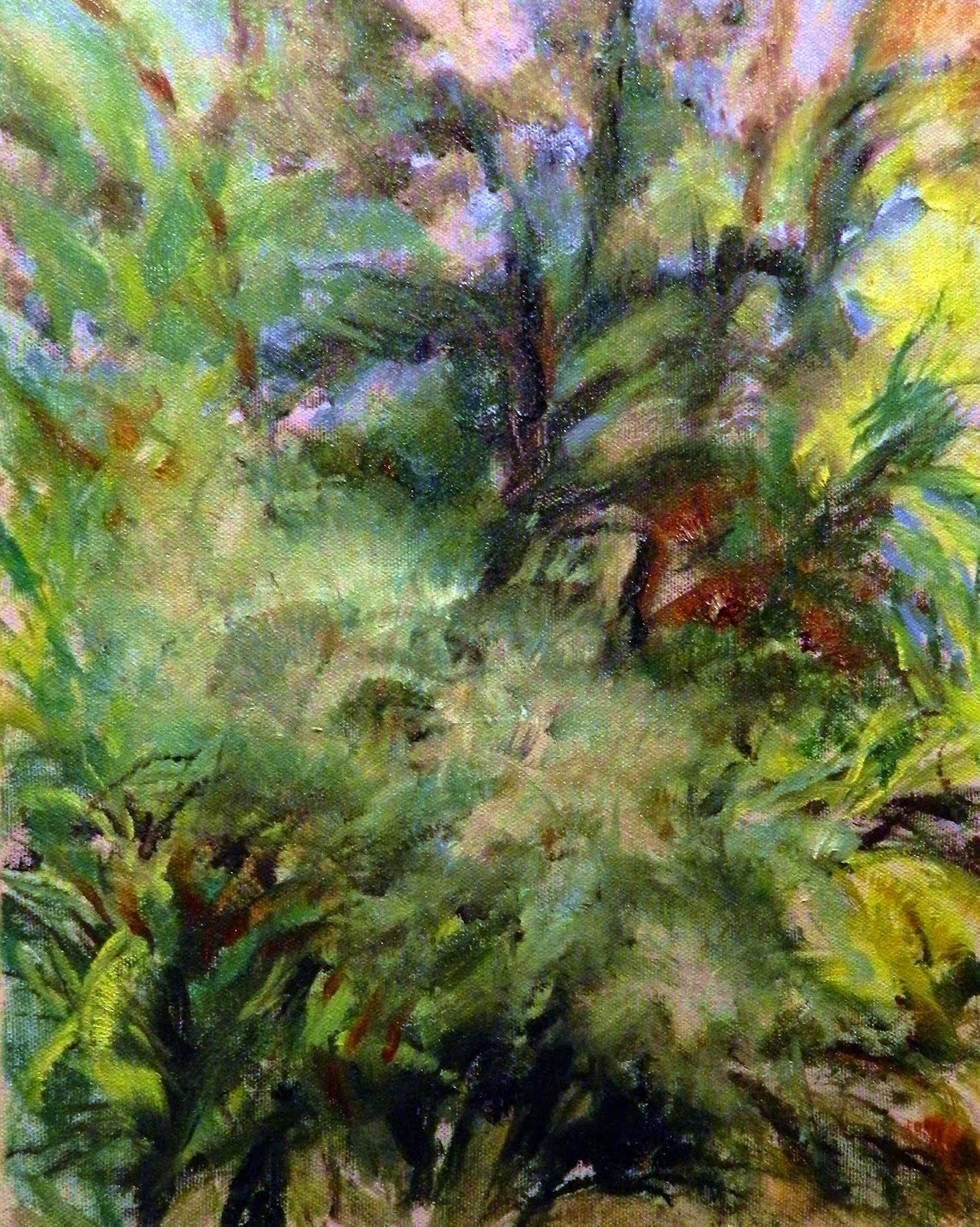 |
| An overdone block-in, but a start. |
With the glorious weather Father's Day weekend, I dragged an easel out back and gave the impressionistic block-in a try in plein air. I chose to paint the contrast of cold and warm of the Olive and Maple tree stand. I got as far as the photo on the right, when I had enough of painting plein air. Stooping to load my brush from the palette resting on the low patio side table and watching suicidal gnats kill themselves in my paint mixtures moved me and the mess indoors--along with the grass clippings that clung to the bottom of my shoes. Lesson learned: don't paint plein air the day after the lawn was mowed and do use the easel you bought for plein air if you ever get the whim again.
This week turned out to be a week. of distress over green and photographic inefficiencies. Schmid mentioned that green was a bear to photograph. He wasn't kidding. I had a heck of a time photographing this green painting throughout it's development. My Nikon L120 and/or my computer refused to record Viridian mixtures as green; the photographs kept coming out blue. I spent the week experimenting with different camera settings--till Thursday when I came closest to duplicating the colors of the painting and realized Viridian wasn't the only green I needed on my palette. I charted the other greens in my paint box to compare and determine which were more suitable for landscapes. Sap green, Chromium Green Oxide and Permanent Green joined my Green Family. My interest in photographic color correction software for the computer got stronger.
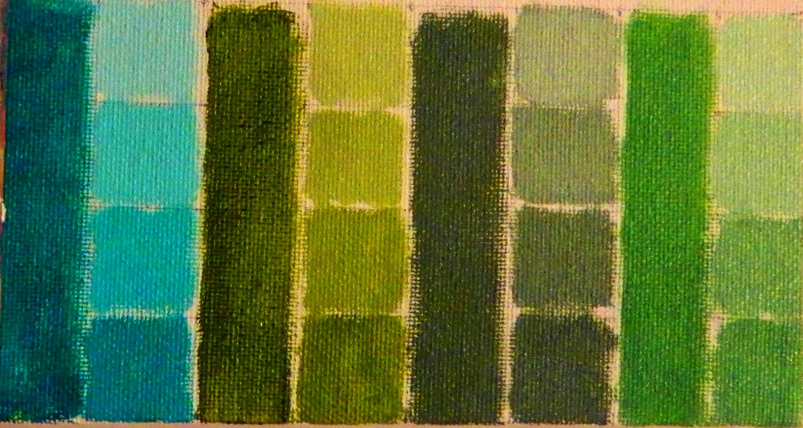 |
| Viridian, Sap Green, Chromium Oxide Green and Permanent Green. |
.JPG) |
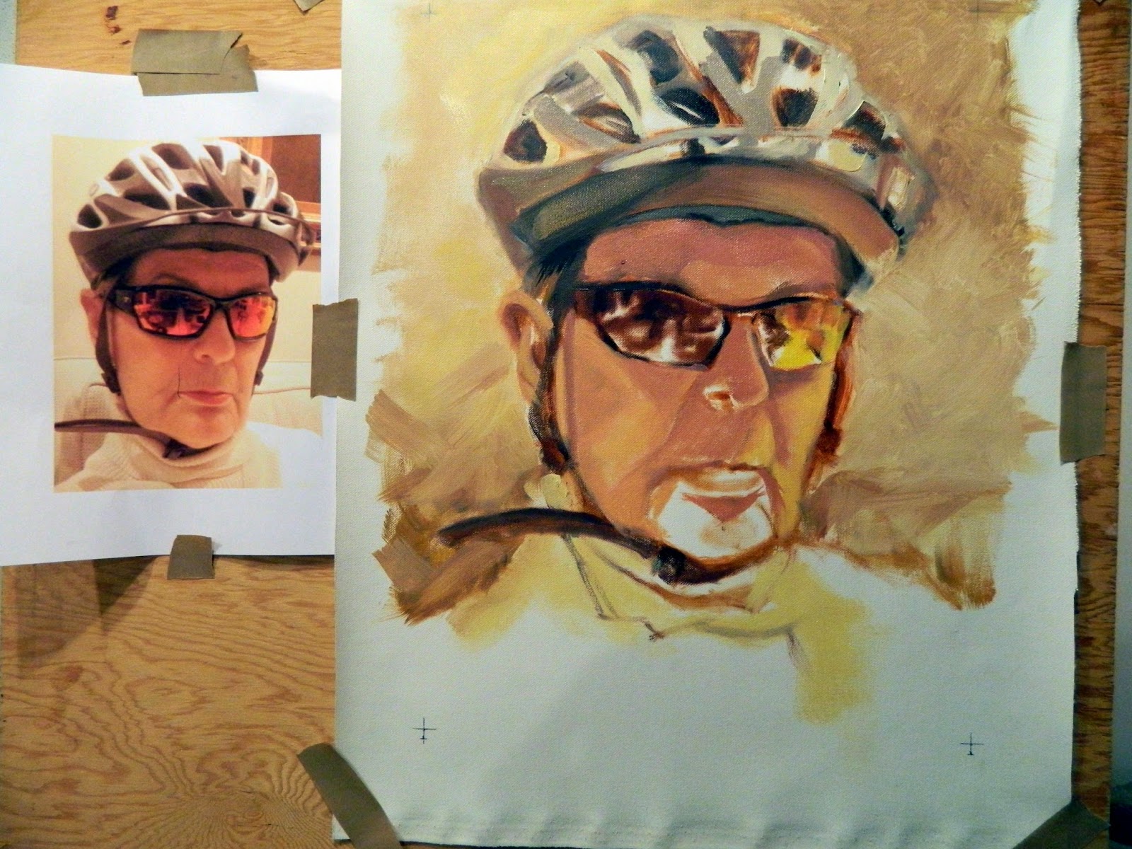
| Schmid Start method 1: Line and Mass block in pushed a little further. I'm still not spending more time mixing the right values than I am painting. So more emphasis on palette time and observation, less time at the easel. and when I do go to the easel, the mark has to be on target. Tonal accuracy begins at the palette with the knife, not a brush. Get over it! |
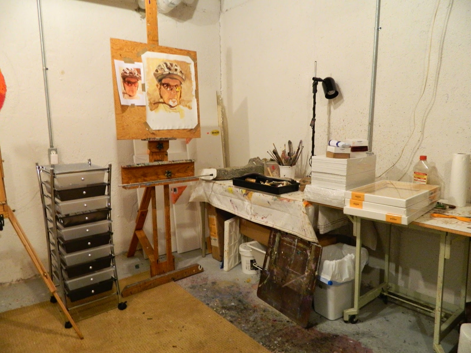 |
| My new oil paint tambour |
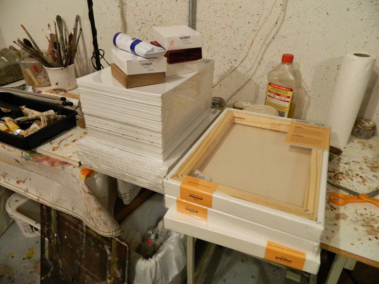 |
| 36 canvas panels; 3 gallery profile canvases, an assortment of oil colors. There's going to be a lot of paintings started; Linda has gotten serious. |
Love that landscape, the colors and the abstract qualities of it and I also like your self portrait, it is coming along nicely, looking forward to see it finished.
ReplyDeleteThanks Roger. Landscapes are supposedly a breeze compared to portraits, but I couldn't seem to leave the painting alone. I do think it was because the only green I was using had too much blue in it and along with the bluish Titanium, all that blue really messed up the yellows to where they needed a lot of toning down with a complimentary till the colors turned to mud, which photographed BLUE. So annoying! And I kept tweaking it. Plein air is supposed to be a delightful time spent in the field with nature, in my mind. Instead, that insufficient palette ruined the whole week!
DeleteHi Linda,
ReplyDeleteI agree with Roger, but will end with: I'm looking forward to seeing if you have the courage to leave the portrait unfinished. Seriously, your sp has all the info anyone would need to know it's you in a bicycle helmet and I'm very impressed with both the values and colors. This must sound funny coming from a compulsive tweaker.
Your dilemma with stingy and excessive rings so true. Over the years, it's become easier to put out more paint, but a distaste for cleaning lots of brushes every evening drives me to overuse of one or two. Of course, this bad habit often results in muddy colors and even more work to correct them. Just can't win.
Another very informative post, Linda. Enjoy your weekend.
Sincerely,
Gary.
I hope I will. I really like the unfinished look and quite frankly, after you've painted what interests you--in this case, the helmet and the glasses, mostly the glasses--what more is there to say about that?
DeleteTweaking is my middle name too Gary. I always think just a little dab there will turn the damn thing into a masterpiece. What an idiot!
As far as brush cleaning goes, I have developed a system for that obnoxious job--a really good swish in mineral spirits till the brush wiles nearly clean, then a really good swish in a mixture of half Murphy's oil soap and half water. I keep a container of MS and a container of the Murphy mix on the paint table and clean I between color mixes if I am using the same brush, BUT THEN I get tired of that and take another brush of the same kind for another color and end up holding four paint loaded brushes in my left hand--not all with the loaded side pointed away from me. This leads to lovely dashes of paint on my smock IF I bothered to put one on. Ellis thinks my trademark is a slash of either Viridian or Dioxinine, the hardest paints to get out in the wash. :-))
Enjoy your weekend too. I'm going to paint my chin; I look like I have a goatee--maybe that's not a bad idea?
Sorry to say this Miss Linda, but I was howling laughing about your description of plein air painting. I think the "suicidal gnats" probably started me off. Maybe start off inside. You have the lovely view from your windows.
ReplyDeleteRichard mixed his greens from scratch and for the transparent stage used V with a bit of transparent oxide red for rich, glowing warm greens. He often put Alizarin in with ii to make subtle lavender tints with adding white. I saw him adding the slightest touch of V to white tomake a beautiful
snow color. This was back in the eighties so maybe he doesn't do any of these mixtures now.
Have you tried having a separate palette for your transparent base? It would leave more room to mix your opaque colors. A paper plate works for me!
You have only just started on this trip and he has been doing it a lifetime so be easy on yourself. I hope you are enjoying it as much as I am enjoying following it.
Don't be sorry, I was hysterical with laughter too as I vacuumed up all the grass clippings I brought into the house from my excursion into the wilds. And yes, I do have a lovely view FROM MY WINDOWS, so I really could paint indoors untroubled by gnats and ants and dragon flies. But Schmid said paint from life. I was just following his advice. Better still life's.
DeleteViridian was the only green Schmid had on what he considered to be a sufficient palette and yes, mixed with TRO with a smudge of Alizarin you do get a lovely warm green, BUT get a little yellow in that mix painting wet into wet and you've got mud that photographs bluish purple and looks lovely in the photo, but like mud in real life. That's what got me to pull out the other greens in my box and start charting them. Viridian plus white is the Caribbean Sea, Not so much the woods behind my house.
my son the Philosopher told me once to stop complaining about how much better so and so painted than I did. He said he may paint better, but he can't design a structure as well as you can. Smart kid; he's in the will. But I still would like to achieve some of the skill that Schmid has achieved. Truth is I won't. He gave it a lifetime. I am giving it whatever years I've got left--then there's Jim Carrey. He started painting in 2012. Take a look at his work. I was blown away by his creativity and flamboyance. Very intelligent. Made me jealous.
Wonderful colors and texture in your landscape, Linda! Excellent piece....and you're right....photographing greens is very difficult sometimes.
ReplyDeleteYour self-portrait is fantastic so far!!! the likeness is dead on!!!
Thanks Hilda. I think I'm going to put a smirk on her face.. There's not enough expression, but, as I said, it's the red lens glasses and the helmet that interested me.
DeleteLinda!
ReplyDeleteI so love "Green Is For Go!" G is for Great! So exciting! Great emotion, power, color, movement! Love this one! "Deep Greens And Blues Are The Colors I Choose!" James Taylor "Sweet Baby James!" Do more!!!
Your Green Wild Powerful Painting Loving Art Buddy!
Michael
Michael. your comments always blow me away. You are a master of stringing together superlatives. I wish I was as fantastic as you say. I'll keep working on it. You keep up the encouragement.
DeleteI love to see how your practice is evolving, with all the material ready for brainstorming in your work room, so well stocked!
ReplyDeleteYour personality emerges clearly with his strength that I really appreciate.
The study of Schmid pays off, through you, but you keep your strong artistic essence. This is truly remarkable and wonderful.
Reading Schmid and trying out his methods has been interesting having never studied painting, but having always painted to my own muse. Studying Schmid is a lot like copying Sargent as I and so many others have done. You see how others work, try their way, then let your own muse back into make whatever you picked up your own. I'm certainly learning how important my palette is and how much time is spent at it getting the value right. Amazing. I was flying on the "that looks about right" color theory. How unprofessional!
DeleteWhat a fruitful week! I'm in love with your top painting Linda. Boldness and freedom come to my mind when I look at your artful splashes of colors. Beautiful! And your portrait is amazing! Listen to your teacher and don't overdo it...:)
ReplyDeleteI love green, so the way you blend colors is always attractive to me. However, I do have a wacky brain, so here it goes. I would love that painting on a landscape canvas, rather than a portrait one. I'm not sure why, but remember, I am a guy who has spent a lot of time in the woods, so I guess I like the width better than the height. Either way, it is very intriguing.
ReplyDelete