Mums' Day marked the end of my color chart project; I was thrilled. Today marks the beginning of another project suggested by Richard Schmid: a painted sketch a day? The subject doesn't matter, the color does.
 |
Cobalt Violet, the color Schmid mentioned as a palette staple, but didn't show in his chart collection. I added to mine.
|
 |
| Alizarin was a tricky chart to make. It over powered the other colors easily. It was particularly difficult getting a distinction between the four yellows. |
And those two charts completed Schmid's twelve color palette. But I added one more: Ivory Black.I think black has use on the palette. It make transparent colors opaque.
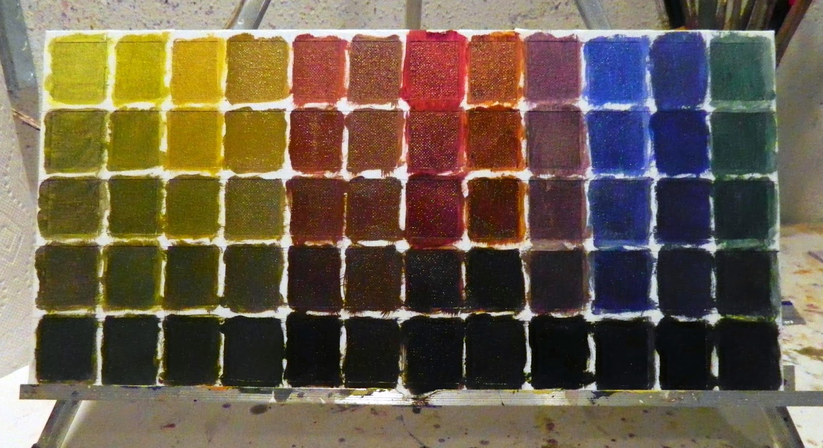 |
To see the color in the darkest shade, a minute dot of white had to be added. Then I worked gradations up to the base mix.
From this chart, one might consider taking the darkest shades and bringing them up towards white, but enough is enough.
|
 |
| My wall is complete for now. |
A twelve color palette yielded 864 colors with another 72 on the Black Chart. That should satisfy my color needs.
Max who didn't get the axe got the benefits of the Yellow Ochre Color Family instead. He's coming along much better. My color charts have taken much of the guess work out of determining the appropriate palette for a painting. Over the past weeks I've learned to mix each one with just the right amount of pigment to white and when in doubt, the right color is hanging just feet away.
 |
| Max is back in action. His dominant coloring is derived from Yellow Ochre. |
I picked up an interesting term from David Hockney over the weekend: SIGHT SIZE. It means choosing a surface size big enough to draw what I see according to the distance between me and the subject. Van Gogh insisted his figurative surfaces were 18 x 24. I like that size too. It allows the painting arm full motion in laying in the shadows, midtones, highlights and lines. For heads, I've been finding this 11" x 9" canvas a tad small. The small size of the space makes me zero in on the face and run off the canvas with the rest of the form. 16 x 12 or 16 x 20 might be more suitable for more comprehensive close-ups? Schmid used 22 x 18. Van Gogh sized his paintings by how many he could get out of a roll of canvas. Hockney constructs his huge compositions in units. Along with painting little squares, I've been doing a lot of reading and video watching.

Congratulations. You did it!
ReplyDeleteOne semester of color theory and charts completed. Now if you stickwith those brands you have forever comfort of mind. The Alizarin Permanent is so different between - for example - Gamblin and Windsor Newton. The Cobalt Violet is very expensive and I congratulate you for getting it. I know Schmid uses it but back in the eighties when he used to live near Denver he would demo at the Artist League and never had it on his palette. Still worked magic with whatever he did. I remember he told us- if we get the values right then the color doesn't matter.
Easier said than done!
Looking forward to seeing the sketches. You will be such a natural for that exercise.
Sargent also used Sight Size. Makes it very easy to get proportions correct.
You go for it , gal. The worlds your oyster.
You are right color theory 101, but oils are a newish medium to me, a refresher course was in order. Did it. Yes, different manufacturers make colors differently. I'll probably stick with these for now. I was more interested in seeing their scope and mixing strengths and weaknesses. The marks one can make with brushes is also of interest to me. With acrylics, I didn't use very many small brushes; I used two inch and 1 1/2" house painter brushes most of the time,. Tube oils call for smaller brushes- with names--filbert, flat, fan etc. Starting out with a new medium calls for familiarizing oneself with the materials. Yes, the world is our oyster--and everyone supposedly has the opportunity to find a pearl. Meanwhile, this is my year exploring oils.
DeleteYou HAVE been busy with theory!!! The colors are beautiful - looks forward to seeing them in action. I had no idea there was a specific term ron an artist's "comfort zone" with resect to size in painting. But then, why not?
ReplyDeleteMax has a beautiful start - love the yellow ochre dominance.
Kathryn
Max got trashed again. I seem to be after something not the norm? The question becomes: if you painted a head and trashed it, then painted it again and trashed it, does that count as two heads done? :-))
DeleteDear Linda, your effort is admirable. I think the result will be amazing ...
ReplyDeleteI made tests a bit 'similar with my watercolors, then I had more ability to manage color, even for the practice of these exercises involve in such large doses.
The extraordinary thing is that the painter studied so much, to be able to forget everything in its action, spontaneous, but without being wrong.
So be it!
You have worked so hard to deserve it widely!
I'm glad the project is over. It was informative. It yielded a great color reference wall that has already been very helpful. However, it was tedious. The lessons made my head swim so much so attempted paintings since have been failures. The project was like taking a tennis lesson. Before the lesson my game was fine and I won. After t he lesson, I was so self conscious, I couldn't get the ball over the net. It took time to get past it. But I do keep going to the studio and trying again. I'm just using up a lot of paper toweling wiping out. the colors are great; the drawing is suffering.
Delete