

Curiosity is my middle name. It's a vital force. It keeps me searching, reaching, growing. This last week I chose to poke around with yellow ochre, the color an artist friend described as boring, lackluster and old fashioned. Well, I'm an old fashioned gal. Yellow ochre has been on my palette from the get go when all I had for a "studio" was the make up desk in my bedroom full of chintz, carpeting and flowered taffeta bedspreads that thankfully didn't show the paint spots that sprayed everywhere as I danced and taught myself how to paint.
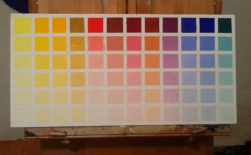
Yellow ochre out of the tube occupies the first square in the top row, left hand corner. All the other palette colors across in that row have been mixed with YO as the dominant. The lower rows are five step gradations towards white. Some of the squares may look alike, but a close up look reveals a slight shift towards warm or cool--that might make all the difference between a color value sitting pretty or looking like mud. (Mud is any color value not in sinc, in harmony, with the others around it. It's not that gray you get when you mix all the colors together to find a common denominator to pull the painting together--the gray way to harmonize color).
As I sat and patiently mixed yellow ochre with each of the other colors on the palette, I was totally involved getting the five gradations towards white even with one another. To do that, corrections had to be made along the way. Different colors having different powers of saturation. There was no set formula to make charting easy, but starting with a smear of white and working from the whitest tint to the darkest color mix worked best. In the process, one quickly learns cleanliness is next to Godliness. On the paint table, I kept mineral spirits and a half and half mix of Murphy's oil soap for thoroughly cleaning the brush between color changes. The palette needed constant cleaning too. No contamination is key to a reliable chart.

Also key is knowing where the five color values fall when compared to a five step gray scale. So I charted that too. It's a handy tool for determining the values of your subject and where to find the value match on the charts. It gives you a place to start and eliminates excessive mixing for having charted the color, you already know the proportions of what to what. For this gray scale I used the faster drying Titanium White and Ivory Black. The black you see though isn't the black of the tube. A little white was added to bring it closer to a number 9 or 10 gray on a photographer's gray scale. You can't see it accurately in this reproduction, but Titanium definitely has a bluish tint--making charting Flake White with Ivory Black interesting IF I wasn't so anxious to get on with Cobalt Blue versus Ultramarine Blue. The two look very close to me who does love Cerulean Blue over Ultramarine and may want to make my own adjustment to Schmid's palette?
Over the weekend, chart number one finally dried enough to remove the tape. Letting the white in illuminated the colored squares that appeared darker, retracted, when surrounded by black. Once again proving that joinery is everything.
While charting took up a lot of time this last week and weekend, it did not get in the way of my working on Rain and My Guys. As a color came up that applied to these paintings in progress, I used it--and I knew how to mix it again when the batch was gone. Love being curious, determined and wiser. Love not stumbling around looking for the right value while wasting paint.
This is one IMPRESSIVE chart!!! You and your charts .... me and my paper mache ...
ReplyDeleteBig hug to you, Linda!
Kathryn
It's the Capricorn influence. It's years of working with grids. It's a lifetime of living color. Hugs back at ya!
DeleteBoring? Never! Yellow Ochre is one of my favorite colors, along with shades of turquoise. I would love an oil painting of that first picture.
ReplyDeleteFunny you said turquoise. Along with ochre, I adore Thalo Blue Green and Viridian, greens that make a turquoise that matches the Caribean.
DeleteI agree. Those of us who enjoy relaxation can handle them.
DeleteThese charts will be invaluable companions on your art journey as will the knowledge you are gaining. At the moment, I am in love with raw sienna. This happens to me on and off. I fall in love with a color, marvel at its power and nuance, incorporate it into all my work, experiment with and challenge it. I really do believe it is a way of becoming intimately involved with each color. And then, one day, I fall in love with another color and the love affair begins anew! Linda, you recently asked me what white I use and I am taking the liberty of giving you a link to read about white. http://www.gamblincolors.com/newsletters/getting-the-white-right.html
ReplyDeleteIt was written by Robert Gamblin and does unabashedly focus on Gamblin whites, but it is definitely worth reading as there is much general information to be gained from his words.
When I did the gray scale using Titanium, the blue of the white became instantly visible. The exercise did make me want to take a close look at Flake and Zinc--which knowing me, I will. Thanks. I'll read that newsletter tonight. --now, of course, I've opened a can of worms with regards to blacks. I used Ivory Black, but also had a tube of Mars. Which to choose? How many charts does one need to make? As many as one needs. Color is definitely a lifetime study. My favorite color was Burnt Sienna, but then I was won over by Transparent Red Oxide. Who knows what color is next? I do. After Cobalt Blue, I will chart a red. With Ochre, Cobalt Blue and probably Terra Rosa instead of TRO, I'll have one mini palette of primary derivatives. Should be adequate for a painting or two?
DeleteDear Linda I also have a beautiful yellow ocher in my palette, is Scmincke and it is always amazing how different mixtures, discreetly and effectively.
ReplyDeleteIt 'a color that seems to improve everything and to paint the flowers is indispensable.
How ocher can be hidden inside an Iris even if the flower is purple ... So I'm not surprised that you find interesting this color, if it is well produced.
I have tried many brands of ocher, but for now Schmincke is unsurpassed.
I like to see the work with black stripes and then with white space ... experience visually, so separated from the paint job, it is always interesting and fun....and your tests are very charming !!!
What I like about having a gray scale is that it really is a great tool for determining which value matches which. I always translate my reference photos to both color and black and white prints. The black and white photos are much more helpful during the painting process--just like graphite thumbnails.
DeleteI am not aware of that manufacturer. Are they in the states? I'll google them. Thanks Rita.
Bonjour chère amie,
ReplyDeleteUne publication pleine d'intérêt... Tout comme Rita j'utilise un ocre de chez Schminck et deux autres de chez Charvin et Blockx.
Il est vrai que je la "cuisine" comme mes plats ! à l'instinct...
Gros bisous
Toutes mes années de peinture, je n'ai jamais entendu parler de ces marques. ils ne doivent pas exporter aux États-Unis? mais peu importe quelle marque vous aimez - et je suis de plus en plus curieux sur les produits de Gamblin - tester le potentiel de la couleur fait économiser beaucoup de tâtonner sur. ce que j'aime à propos de la palette de Richard Schmid est de savoir comment les couleurs peu que vous devez faire beaucoup. une palette limitée maintient la vie de simples du peintre - et il n'a pas de mal à économiser tout l'argent de certains de ces couleurs exotiques coûtent de plus de toiles.
Deleteall my years painting, i have never heard of those brands. they must not export to the US? but no matter what brand you like-- and i'm growing more curious about Gamblin's products--testing the color's potential does save a lot of fumbling about.
what i like about Richard Schmid's palette is how few colors you need to make so many. a limited palette keeps the painter's life simple--and it doesn't hurt to save all the money some of those exotic colors cost for more canvases.
I also love yellow ochre. Often try to make it "from scratch!" Love your color value charts! Very worthwhile!
ReplyDeleteHappy Spring!
Take care Linda!
Michael
So funny that your friend "doesn't like" yellow ochre! She's pretty off-base, if you don't mind me saying so. You are doing a wonderful job with your color grids. It's inspiring!
ReplyDelete