 |
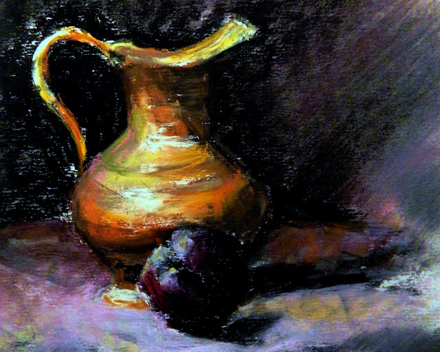
| Pitcher With Black Plum, Pastel, student work, one hour. |
Halloween or no Halloween the pursuit of artistic growth carried on yesterday with this hourish long drawing. It still needs work, but this is as far as I got, before I had to grab lunch with a friend, jump on my broom and carry on the shenanigans of things that go bump in the night. It was hard to leave. I am enjoying the class.
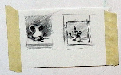 |
| Thumbnails, I did two, but many more were needed. |
Vianna began with talking up the value of thumbnail sketches--the importance of doing as many as it takes to find the right composition before beginning a painting. I cringed. Russel Keater, my first respected instructor adored the little thumbnail exercises. At seventeen, I hated them. They were too teeny tiny, a waste of time. Now I'm more open to suggestion. After doing two of the two simple still life set ups, I really wasn't pleased with either enough to go through the trouble of making a painting. But I was stuck. The room was over crowded with artists, easels, supply carts and stools.It was impossible to walk around and do thumbnails from all angles (as I suspect you should) till you found the right one and then move your furniture set up in the position where you got the one that pleased you the most.
 |
My first drawing done on my own after class last week.
I'm told I went into the drapery too much, but drapery fascinates me.
It has the power to liven up a painting with directive action. I think it
could be a subject by itself. |
I don't like the composition of this drawing; the plum is too lined up in front of the pitcher. It had to be balanced by strengthening and playing up the cast shadows.I would have liked to sectioned off the drapery, but Vianna frowned at that and I was in her backyard. My black is still too black. It needs color worked in. And I really do suck at velvety drapery. I don't see soft; I see geometric forms much like the Cubists that could be used as directives. I DO LIKE WORKING OUT COLORS AND VALUES USING PASTELS. The medium really does go hand in hand with oils.
NOTE: The sanded paper really does great cutting the dust, but nevertheless there is some. I wore my patent leather witch shoes and they really needed to be dusted off before I took off. I also threw a large nail brush into my case when I got home. My hands really need a scrubbing after the session. Three washes didn't do it. But what the hell, it was Halloween and witches don't have the cleanest nails on the block.
NEXT WEEK: WASHES USING WATER, REGULAR TURPINOID (NOT THE OILY, ORANGE STUFF)-- OR RUBBING ALCOHOL.
I might play around a little with that between now and then. I do think I would like an under-painted surface on these off white sheets. I think a sanding board may be in order, also an 1 1/2" housepainter's brush.
Today, back to Mr. FP.


This is a great report, and fuel for my own students. I am indebted.
ReplyDeleteAgain, I think your blending of colors (and I see your note about pastels and working out colors) is very good. It is a painterly ability.
Best wishes. Your crits are serious, but have some fun, too.
BTW, I was doing some self learning this week (read: copying another oil painter's technique) with the pastels. I did three finished pastels that still didn't say what I intended, and then reverted to doing a thumbnail and that resolved my compositional problems.
ReplyDeleteYesterday I understood the value of thumbnails immediately, whereas at seventeen I did not. But not being able to move around the set up limited the value of the two I did from my position. You couldn't avoid it; the class was full, but at home in my studio that won't be a problem.
DeleteI think all artists are critical of their own work. It's part of stretching to be as good as you can. Some errors I note, I know only I can see them; others, are glaringly obvious--like the black background that should have had an underlayer of all the other dark pastels in my boxes. By itself, it's too dead. But I'm not there to make masterpieces, I'm there to make mistakes and learn where I went wrong. I did.
I am having fun making mistakes with the other kids. Until I joined the association and started taking the classes that will serve my portraiture well, making art all by myself was pretty lonely. I have finally found some live action with people who think like I do. I love it.
You might find fault with this but my initial impression is one of such glorious colour mixing..... I love the light and rich warm tones of the pitcher set against the deep darks, particularly the ones in the plum!!I also love the mix of faded colours to the right and foreground so the position of the plum doesn't bother me, it is the beautiful colour you have achieved which sings to me!!
ReplyDeleteThanks Judith, I really appreciate that, but alas too late. Today I worked in some kindred colors and then blackened them. I wanted to pull everything together. I'll have to see how my adjustments look reproduced by computer. Translating art exactly is not an easy thing. I sometimes sit for what seems like hours trying to reproduce art as close as the technology allows. I wasn't satisfied with pure black; it needed some variation.
DeleteI like the pastels, but I love those thumbnails. They got such graphic impact and are so simple but full of character. Happy painting.
ReplyDeleteWhen you work that small, drawing is reduced to positioning values. Those rectangles were about one and a half inches by two and a smidgen. Happy painting to you too Roger.
DeleteHmmm ... it seems like Vianna already has you deep in the depths of composition already. It was SO much easier when we just painted in ignorance. :)
ReplyDeleteThe whole thing about composition is to keep the viewer's eyes on the picture via the interrelationships of darks and lights used as directionals toward the focal point. From what I recall. There's asymmetrical and symmetrical balance. Mr. FP is an asymmetrical composition. High lights on Taylor's nose and chin will keep the eye from going off the 'page.' Taylor is really just background, but those subtle highlights play an important part. The strong lights on the cat say clearly he is the focus. And the main focus of him is his eyes every mark will take the viewer back to his eyes. I didn't do any thumbnails for him. I did play with cropping and adjustment in my photo program. The original photo Taylor and the cat were just a part of a busier picture. I cut out most of it, as the photographer should have.
DeleteWith this picture I painted it vertically but cropped it when I got it into the computer. The original has to be cropped for real. The computer can be as helpful as thumbnails. Thumbnails are great for alla prima; computer photo adjustment and cropping work very well to help realize your vision when working from photographs. Also black and white studies in charcoal or under special effects in the photo program menu is a great way to see the values and zero in on what interests you, what are the darkest darks and what are the lightest lights. And that's all the tricks I know about composition.
In my work, I tend to compose on a diagonal, horizontal and vertical orientations are really very unusual for me. But where ever a directional line intersects another line something important has to happen there. That's probably Kandinsky's two cents.
You said a mouthful! And a good one. :)
Delete(sorry I had a typo...!)
ReplyDeleteWell.......your painting looks great to me! I really love the darks against all that warmth in the vessel.....wooooo hoooooooo what drama! I just wrote a post about what is wrong with so many paintings (mine and everybodys!) ,,,it seems we have too much in the 50% value range. Now THIS has interest because the darks are such a great foil for the golden pot. The darks make the brass just sing. Bravo! I really like it (and the plum has perfect colors too).
I'm not going to lighten up the black, I'm going to enrich it with some of the colors in the pot--and I did. I'll show it next post. It was too dark out to photograph last night when I got around to it. We'll see it for better or worse? There's a lot to be said about that's as far as I want to go with this one. I did get to that point in class, but we still had a half hour so I kept fiddling with it, but I was ready to pack up. Problem was I had a lunch date and would have been too early; I couldn't just leave.
DeleteBeing nearsighted, I am naturally drawn to the darks and lights and the mid tones are my biggest problem.:-) I noticed a few of the other kids in class had a little framed piece of red cellophane. It was a value detector. I looked through it for a minute and I could see where it might clarify sorting the tones out. Standing back and squinting does it for me.
I like to follow the beautiful evolution of your pastel!
ReplyDeleteAt the middle school, art teacher taught me to use charcoals, chalks and clays also from the side, but other than, I do not know.... more. Dust is not a small problem for me, at the level of the breath.Pastel it is a medium of work and study, so charming and I rejoice with your post!
Thank you, Linda!
The dust is there, but it really is under control with the sanded paper. No blowing is necessary. The paper grips the particles.
DeleteWhat makes pastels attractive to me is its immediacy. I don't have to wait for anything to dry.
Working with pastel washes has potential too. When initially we needed some Turpenoid, this week she said water would do. I watched a video on the subject and they were using rubbing alcohol. It seems you can experiment with solvents as long as you don't use one that is oily. You want fast evaporation. Liquifying the pastels would work against cutting the dust since liquid would fill the pockets of the sanded paper. --At least that's my reasoning?
A dust mask is always a good thing to have around the studio--along with rubber gloves that fit.
The medium is so intense under your hands, I like that very much!! Pastels can be very sugary in a corny-ish kind of way. But you take it elsewhere and I love it! Then again, little witches always takes us elsewhere and bring magic to our lives :)
ReplyDeleteTrick or Treat- Eat, drink and be scaaaary!
Dear Konstantina, I am heavy handed with pastels and heavy footed on the gas. :-) I am also attracted to the darks and lights and the midtones confuse me. It always takes me the longest to discover the best blah color to bring the extremes together. That's why I like the grayed down colors like dusty olive green and yellow ocre and washed out blues. They are a sure bridge when it comes to midtones. I discovered that in my crayon box when I was a kid.
DeleteThank you. But didn't I tell you I felt pastels might be for me? I don't break my neck to get some place by nine o-clock in the morning for nothing. It's killing me. :-)
I love it. It brings me back to my own art lessons.
ReplyDeletePah! This is no student work!
ReplyDeleteThanks Dan. It did stand out in class. These ongoing professional educational courses (OPE)are wonderful for brushing up (sorry, pun)skills and getting out among artists as passionate as you are. These sessions are also validating--when your painting goes well. They are discouraging when it doesn't and someone else's does. Keep on truckin'.
DeleteLove the darkness in this painting, amazing how shadow enhances the rest, I must learn to use more darks !
ReplyDeleteA common error painters make is they don't make the shadows dark enough. Thanks Jane.
DeleteI never had that problem. I usually go too dark too fast. That's why I have such difficulty with watercolors and consequently, don't like the medium much; I can't correct those paintings very easily. My process is to do darks first on a previously laid ground of a medium color. I've been nearsighted my whole life and the darks always defined what I was looking at and gave it meaning.