 |
| Carousel, 7" x 10" watercolor |
The buyer of
Carousel came to the house Friday to pick it up. She liked the watercolor, but was a bit disappointed that the horse wasn't as red as she thought it was from the picture she had seen on my blog. (What you see that's pink is actually a pale orange wash). Her reaction got me back to thinking what I could do more to increase the accuracy of the colors of my computer reproduced photographs. I used
Steve, the little portrait in progress on the easel to take a look at how I was processing my photographs in my computer with the tools provided by Jasc. Photo Album. The camera I used was my Konica Minolta Dimage X1, digital, handheld, with default settings. I was wanted to take the time to experiment, because I believe accuracy in photographing art for sale or show is imperative for customer satisfaction and avoiding embarrassment when photographed work doesn't quite match the real thing.
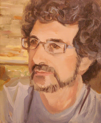 |
Steve taken ,under the incandescent lights
of the studio with no flash , then transferred to computer.
The computer copy has warm, even tones.
The contrasts are evened off and diminished as well. |
.JPG) |
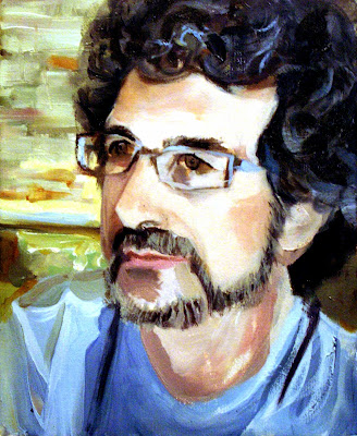
The above photograph touched up: 1)quick fixed; 2) color balanced;3) less exposure.
The skin tones don't match; they're pale and not as rich. The shirt and the hair are too saturated. The grays in the
background are right, the pink in the background is Cadmium yellow light in reality. |
 |
Steve taken with same camera, default settings, outside,
in open shade, NE exposure, 4:30 PM. A bit washed out wouldn't you say? |
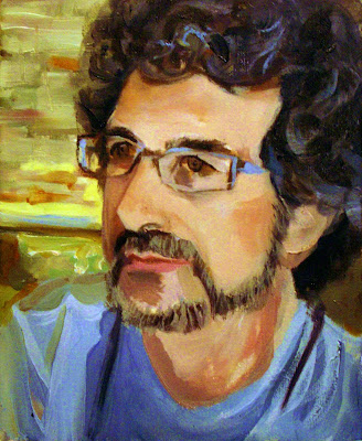 |
Steve, the photo taken outdoors in open shade, put through the ringer using Jasc Photo
Album's adjustment tool to get the closest match possible to the real painting.
This is as close as I could get to matching the skin tones, : 1) quick fix; 2) Color stretch; 3) Less exposure; 4) more vividness. But they are still a tad darker than in the actual painting. The shirt, his hair and the background
are more saturated as well. The yellow is accurate in the background. No cigar here.
|
Bottom line: color reproduction disclaimers are necessary showing art online or in photographs to be submitted or e-mailed. This poses a potential problem with online sales or photos used for submission to competitions. I can get close with Jasc photo album, but not on the money. I don't think that's good enough. I also suspect that the ratios of red, blue and yellow to one another in a painting have a lot to do with how the photographic reproductions look.
What else isn't good enough is that I can't show these painting abreast on blogger so you can really see the differences without having to scroll. Three photos should be able to be lined up--left, center, right- side by side. I haven't been able to do it. If anybody has, I'd love to know what they did. --If anybody has a more accurate photographic adjustment program, I'd like to know what that is too. I really didn't like my buyer being a bit disappointed.
.jpg)


.jpg)


.JPG)

Sorry Linda, but you know me and photography!
ReplyDeleteYou're lucky you don't have to worry about the accuracy of the photography. Shades of gray or black and white text is the way to go for your work. Not so when color is involved. I was hoping to find a formula, but I suspect each painting requires an hour or two of experimentation. Life was a bit easier when 35mm film and slides were the best photographic form. The colors were always accurately reproduced providing the photographer knew to use Ectachrome (blue) or Kodachrome (red) film. Ectachrome, if I recall, was best.
DeleteI've had the same problem. At the Gurney Journey blog he had a post about photographing his art with a whole jury-rigged setup complete with reflecting garbage can lid if I remember right. What I found most interesting is that he put a color strip next to the painting so you can tell right off if the color is off and how just by looking at the strip.
ReplyDeleteI took the photograph outside in open shade on an overcast day--so there were no reflections bouncing off of anything. I laid the painting flat on the ground and held the camera lens parallel over it with a slight tilt down to correct the parallax line problem. I think if you have to start bouncing reflections off of garbage can lids and using key lights and spot lights, there's going to be all kinds of different results depending on different palettes. if this guy used a color strip next to the painting why wouldn't the color strip be as misread by the camera as the painting?
DeleteWell that's the idea - you can compare the strip in your hand to the one in the photo and see where the difference is right off.
DeleteThe problem is even worse than you are imagining. What the image looks like also depends on the computer on which it is viewed and what its settings are.
ReplyDeleteMy images look different on my desktop and my laptop.
OMG. I never even thought to put the photo into my desktop computer. That would drive me crazy. Best to keep the problem simple and use just one device.
DeleteYou know Jean. I am a big fan of DeKooning's. I have all sorts of art books on his work. But when I have run into the paintings in museums exhibits, they are less colorful than the photographic reproductions in the books. Maybe that's just how it is?
An artist whose paintings to me looks shockingly different in person is Georgia O'Keeffe, but that mostly has to do with the quality of the brushwork.
ReplyDeleteI was disappointed with O'Keeffe's work in person. I am thinking particularly of Jack-in-the-Pulpit. It was a small painting. The colors were no where near as vibrant as those in my book. The brushwork was sloppy and not at all assured. The show made me sad. I thought I had been duped. Now, by my own experiences with photographing art, I know I wasn't. The art we see in translation isn't the art that is. You'd think with all our technology, we should be able to translate an on-the-mark reproduction.
DeleteI now think of O'Keeffe as an artist meant for reproduction. It's where her work is brilliant--and actually improved.
DeletePhotographing is always tricky, I think it is very difficult to get the exact colors on the computer, sometimes they are better, sometimes they are worse...I can fully understand your not being happy with the slightly disappointed buyer .
ReplyDeleteI just don't like the possibility of a buyer thinking I might have tried to "pull one over" on her. I think part of being a selling/exhibiting artist has to do with being a decent photographer and a computer image reproduction geek. Maybe these photographic programs need further development beyond than making family photos look fantastic?
DeleteLinda ánimo. Con la práctica todo se solucionará. El retrato te ha quedado muy bien. Saludos :)
ReplyDeletesonia, I don't think this will be totally solved. Color dominance seems to have an effect. To have run a more scientific (I say the word lightly), I would have had to use a number of paintings each with a different primary as the dominant color. I think we just do the best we can.
DeleteWish I could help, Linda. I'm lucky to have Lorie do my formal images with the D80, and something called "white balance." I thought she was talking @ the clothes washer.
ReplyDeleteWe take either of two ways. Both with the tripod.
1.) Tungsten lights (3500?K) at 45degree angles either side of the art. At night. She brackets, because the temperatures do vary with white balance.
2.) The latest crop of images are done with the art flat on my taboret, with north light grazing the art. It is an awesome effect, picking up texture. It frees us up, because it is harder to get out to the studio at night. So far, so good.
My iPhone photos are a mixed bag. The only thing I think that improves them is the quality of the daylight.
Bracketing has always been a good idea in Photography Casey. With oils one has to be careful with those tungstens on either side. Oils, with their sheen,take better with reflected light. I think the best is what you're doing and I usually do: natural light grazing the art which is lying flat. I can see the texture on your pastels, it looks wonderful.
DeleteLinda, that is one of my biggest pet peeves in painting. The camera is not able to realistically present the image colors. Of course, so much depends on the lighting in which one views the painting, regardless of whether in real-life or computer image. A friend of mine recently said that she was surprised at how much better watercolors were in reality, as compared to computer images; she did not always find it to be true with oils and acrylics. Who knows? I know, and often comment to that effect, that I try so hard to get a good color representation of my paintings on the computer, and almost always fail. As of now, they are not sensitive enough a medium.
ReplyDeleteI think watercolors like Carousel are perhaps more difficult to photograph than oils and acrylics. The pales washes will tint differently depending upon adjacent colors--like the yellow being lost from the orange wash in Carousel leaving only pink.
Deletesometimes my paintings look better in life, sometimes they look better on the monitor. I do try my best to make the photo "match" the painting, but I don't always succeed. I use photoshop. Here is a blog post that I particularly liked:
ReplyDeletehttp://candacexmoore.blogspot.com/2010/05/phototgraphing-your-artwork.html
p.s. I like your portrait! Nicely done.
Thanks, I'm still fiddling with him. He sent me out to the supply store for a smaller fan brush. I'd like to get more "hair" in the hair. I just copied the link. Thanks. It's a shame when we comment we can't put in a link and click directly to it. I'll send feedback. Blogger will get right on it.
DeleteI think I'm going to try the color-strip idea--that sounds like it has potential to make the photos better.
ReplyDeleteI've had a professional do some photography of my art. That wasn't the solution.
The cheat's way out of all of this is to have the business address of an IT/ Computer repairman - tell the customer it must be their computer that's at fault, and give them the address.
ReplyDeleteAfter all, even if you got your screen output 100% right, how do you know your client doesn't have a dodgy computer.
PS 'Idiot!' Saved you the bother of tying the word :0)
I have mastered my camera this morning and my photo adjustment tools. I am a happy painter. You know, sometimes, you just have to read the manual closely and apply the knowledge to what you already know. I did. The photographs for my newest blog are on the money. I'm ignoring the idiot thing. That was a terrible word for me to use; I must have been very frustrated at the time and not in the mood for levity--which you are very good at.
Deletesorry your client was disappointed linda ..reds can be very difficult and blues interesting post ...glad you feel you've mastered your camera now .
ReplyDelete