
What more can I tell you? mandalas are not about teenage love, they are self revealing by interpretation of the pictorial elements, via interpretation of the "Principles of Visual Harmony." Carbonetti in her book The Zen of Creative Painting, An Elegant Design for Revealing Your Muse lists them as:
Story. What's the picture about;
Focus. The spot that your eye is drawn to immediately;
Composition. How the positive and negative pieces fit together;
Value. The light and dark hues and shades, bright and grayed tones.
Color.The color system chosen, i.e. complimentary, analogous, monochromatic etc., and the psychological meanings of those colors;
And finally Texture. How the piece was rendered--solidly, loosely, "the feel of the thing," The way the medium was used.
The principle that interested me the most was color, for color is what painting is all about in my opinion. The author goes into the psychology of color lightly:
"Red: groundedness, vitality, passion.
Orange: creativity personal power, emotion.
Yellow: consciousness, awareness
Green: growth, nurturing, opening.
Blue: expression, willpower.
Violet: intuition, wisdom.
White: light, completion, openess."
I thought white shouldn't have been listed. Zen is an Eastern philosophy. I do believe that white is associated with death in Eastern cultures and I myself regard white as a non-color, the same as black. In watercolor paintings where the white of the paper is left untouched. It's either a "highlight," spots where the sun's brightness washes out an object's color, or it's negative space-- in between space, space that defines what's positive, but where nothing much else is going on. I guess I would also describe white as reflective--and here am I do just that.
Another principle of harmony would be form I think. But the author didn't list it as one of the revealing principles. I would like to add it.
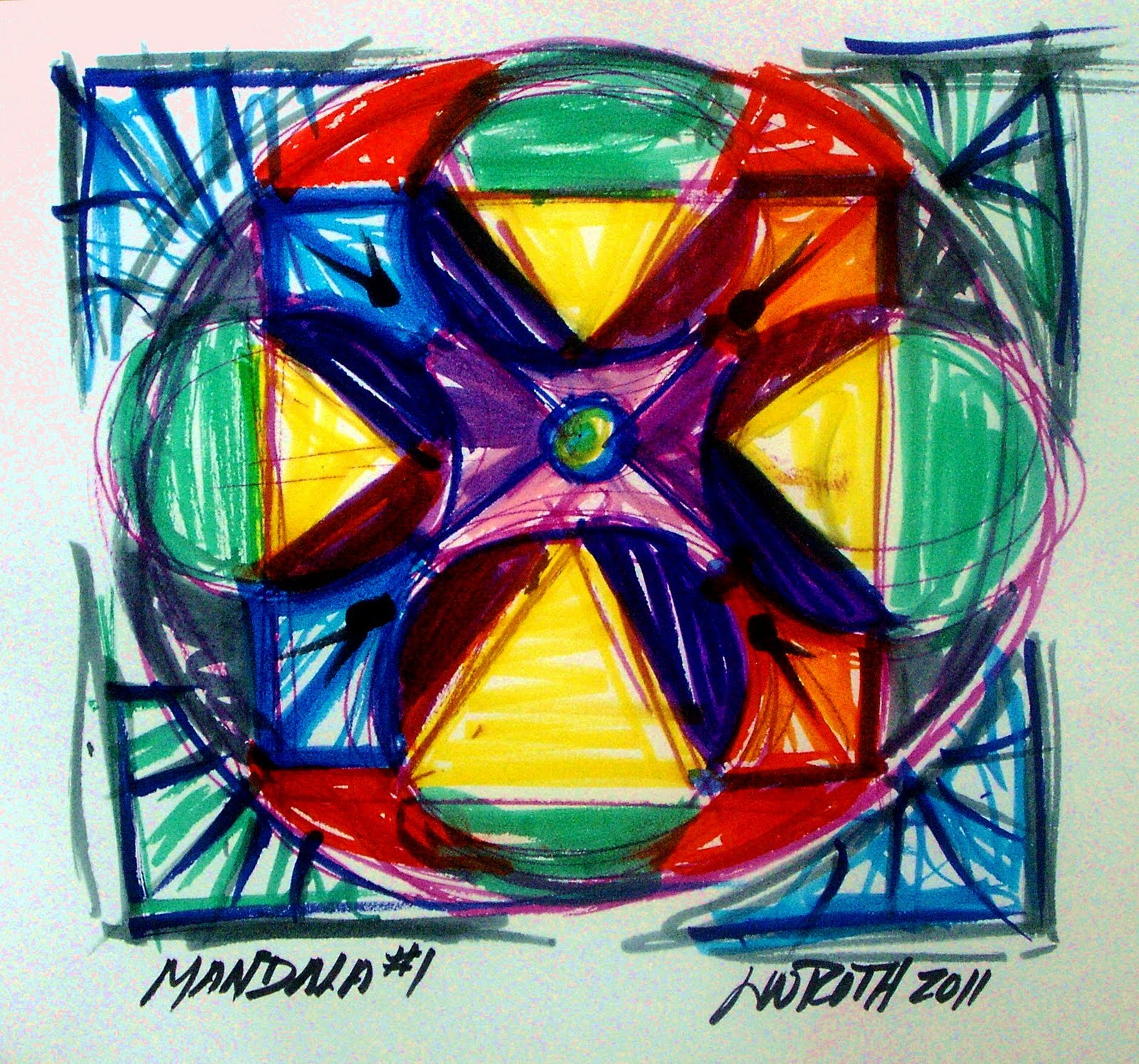
When I did my mandala yesterday the very first thing I thought of was form. I began the drawing with a square and ended it with one. The square is a ridged form. I chose it because that's the form I have kept choosing over and over again for years. I paint on square canvases. I use the grid system all the time for design diagrams. I named our first architectural furnishing design company Cubi Craft, a name that meant nothing to the general public,(bad thing), but something to the small number of artists familiar with David Smith's sculptures that we ran into, (hardly any). To the Egyptians a square hieroglyph, meant "field." To me, a square means consistent, dependable stability, a form one can use to build upon. A form that is reliable. Of course, I colored it yellow, pure yellow, the color of consciousness and awareness.
I was totally aware and conscious of the form I was choosing to start the drawing. But then I colored it wrong according to Johannes Itten, The Art of Color. Itten says my square should be dominated by red. Well, right away we would have a disagreement. But then I would have made him happy. I broke my square up into triangles pointed toward the focus of my drawing. The triangle is the appropriate form for yellow, according to Joe.
Form plays a part in revealing our inner muse and should be considered when "reading" one's mandala. What do you think? Then: What do you think when I say just sitting down consciously to make a mandala distorts the truth of it? Then what do you say when I say, all our paintings are mandalas? I'll read on. Obviously, I still have some reluctance here to be open--but then I'm a square and my muse is definitely frisky. Just look at all those colors and forms in my Rosette window.

No comments:
Post a Comment